You finally bought your paint and you’re ready to go. Now what? How do you actually use gouache?
Don’t worry! I have you covered. Let’s call it Gouache 101. I’ll walk you through the basics of mixing gouache and finding the ideal consistency—two things I get a lot of questions about.
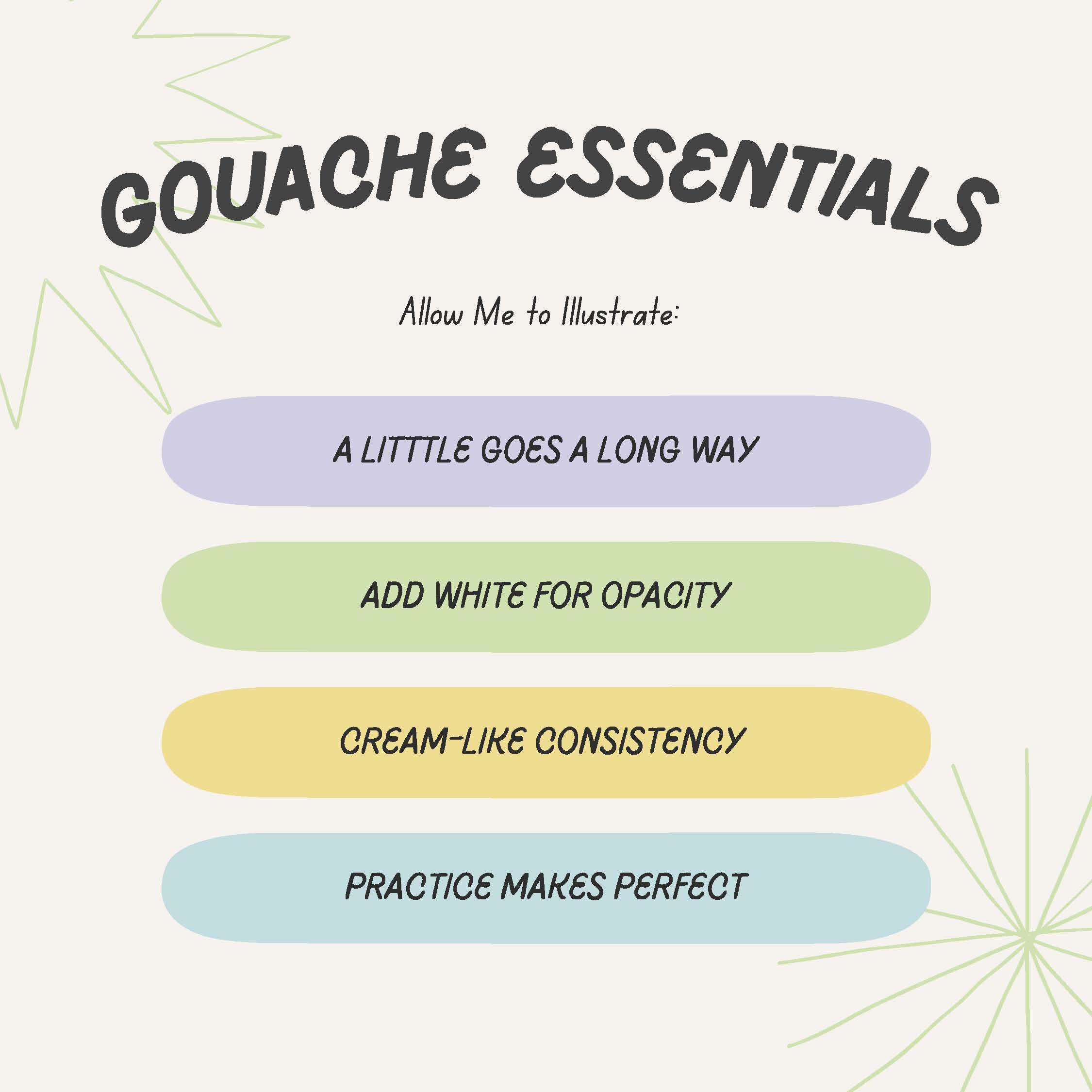
Mixing 101
Most gouache is heavily pigmented, which means that a little goes a long way. I’ve seen beginners empty an entire tube of color for one project, and I’m here to tell you do not do that. A small dollop should be more than enough, especially if you’ll be adding white (which we’ll talk about next). The only time I recommend making more paint than you need is when you’re preparing to cover a large flat section, like a background. In that case, it’s a good idea to make sure you have enough paint to cover the area plus a little extra in case you need to touch up later. If you end up with leftover paint, it’s not a problem. It’s easy to store and you can always use it in another project.
Why White Is Your Gouache Bestie
The color you’ll use the most when mixing up your paint is white (in that way it’s like mixing acrylic). White increases opacity and stretches your colors, meaning that you’ll have more useable paint without sacrificing coverage. It doesn’t dramatically reduce color saturation, but it does give you more to work with. This is a big win! You’ll need less paint to cover up large areas like backgrounds, and it saves you from having to layer too much (which is a different problem, but I’ll cover that in another post).
There are a lot of opinions about which white is best for mixing vs. highlighting, and how each one affects color. Here’s my take: I use them all at different times for different purposes. It depends on what I’m trying to achieve and I’ve only figured that out through trial and error.
I think it’s important to find what works best for you and your practice, and I encourage you to play with options and see if you have your own preference. There’s a good chance you’ll end up like me and love them all for different reasons.
Choosing your White
Zinc White
Zinc white is an artist favorite for mixing. It’s the most lightfast white and it only changes color saturation subtly, if at all. It’s the least opaque of all the whites, which is something to be aware of when choosing it as a base. Lastly, Zinc is a warmer white. This is not the best choice for highlights.
Permanent White
If you want something more opaque, use permanent white. Some artists balk at this, saying that it does too much to desaturate colors and gives them a gray tinge—but I disagree, and I actually prefer permanent white over zinc. Because I use it as a base when mixing colors, I find it helps unify my palette too! Permanent white is a cooler white. It’s very opaque, making it the best choice for highlights.

I used permanent white to add these little hairs in. Notice how opaque they are against the bright blue background!
General Rules for Mixing
When slightly adjusting a color, start with your tinted color as the base and add in a small amount of white until you reach the hue you want. In general, this is a good rule for mixing any variation of a color.
However, if you want to make a lighter version of a color, like pastel, start with white as your base and slowly add in your tinted color. This prevents you from adding too much tint and accidentally making a dark color. The only fix to that is adding a ton of white to balance it out again— which is both hugely inefficient and annoying.
With gouache, your lighter colors always dry darker, and your darker colors dry lighter. It’s worth making a color swatch on a scrap piece of paper before committing. If it’s not the right color, continue adjusting and swatching until it is.
Side note: Don’t be discouraged if mixing the perfect color takes time. It happens to all of us!
A Note About Black
Black isn't always just ‘black’ and each shade will have a different base tone.
Lamp black is cooler and turns gray when white is added. It’s the most opaque.
Ivory black is warmer and has subtle brown undertones. This comes out when you mix it.
If you’re trying to make a color darker, start with your original hue and add black in gradually. Black is incredibly strong and a little goes a long way! Adding in a small amount at a time ensures your color won’t get too dark, too fast. Again, we’re trying to minimize waste and maximize results!
Color Transparency And Troublesome Shades
Some gouache colors are more transparent than others. Reds and purples can be tricky, and I’ve found that they’re often too sheen and they fade quicker than other colors. They’re considered unstable pigments, so I would avoid using them as a base color. They work great as an accent though! If I’m covering a large area and want to use one of these hues, especially red, I’ll often switch to Acryla gouache. In general, Acryla is more reliably opaque and streaks less than traditional gouache. For small areas, I’ll wing it and decide as I’m painting. Sometimes regular gouache works just fine, and in others I’ll pull out the Acryla instead.
Avoiding Muddy Colors
Gouache can get muddy quickly, so unless you want murky colors it’s best to stick with a limited palette. Don’t go too crazy with colors yet (I know, it’s a hard ask when the colors are this tempting). Start with a few colors you love straight from the tube or add a bit of white. Let yourself adjust to the paint and understand how to use it. After that, explore away!

I used Acryla gouache to get this red background. I knew using regular gouache would lead to streaking and I didn’t want to risk it.
The Ideal Gouache Consistency
The ideal gouache consistency falls somewhere between runny and thick, which takes a bit of practice to master, especially if you’re coming from a watercolor or oil background. Add too much water and the paint becomes overly transparent; if it’s too thick it can crack when it dries. My ideal consistency is similar to the texture of heavy cream. Your paint shouldn't be dripping off the brush and should have just enough water to move fluidly across the page. It takes some hands-on trial and error to understand what that looks and feels like, but you’ll get it!
If you want to use gouache as a wash, you can make it thinner by adding water—but be mindful of puddling. You’ll want to keep an eye on it. Puddles will make your paper buckle and that’s never a good thing! We want our surface to stay nice and flat.
That’s all I have for today. I hope this information helps you understand gouache a bit better and encourages you to start playing with it. As with anything, have fun and experiment! Let me know how you get on in the comments, I would love to hear your thoughts.
My next post will be all about the best practices for layering so keep an eye on this space!
x
Manda